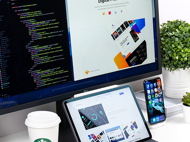
Responsive Design for Web Designers
1 Hour
$19.99$80.00
You save 75%
12 Lessons (1h)
- Your First Program
- Course Intro
- Foundations of Responsive Design
- Coding Responsive Design
- Wrapping up
DescriptionInstructorImportant DetailsRelated Products
Learn How to Create Flexible Designs That Truly Look Excellent on Every Screen with This 1-Hour Course from Mark Lassoff
ML
Mark LassoffMark Lassoff | Programming Instructor
4.4/5 Instructor Rating:
★ ★ ★ ★
★
Five years ago Mark parlayed two decades of software development experience into his latest entrepreneurial venture, LearnToProgram Media.
LearnToProgram Media publishes online courses that teach mobile, web, and game development. Over 500,000 people have learned programming from Mark through online classes he has either authored or published. In addition to publishing popular courses and books, LearnToProgram Media operates an internet video network that produces several programs on software development.
Terms
- Unredeemed licenses can be returned for store credit within 30 days of purchase. Once your license is redeemed, all sales are final.
Your Cart
Your cart is empty. Continue Shopping!
Processing order...